 "ttyymmnn" (ttyymmnn)
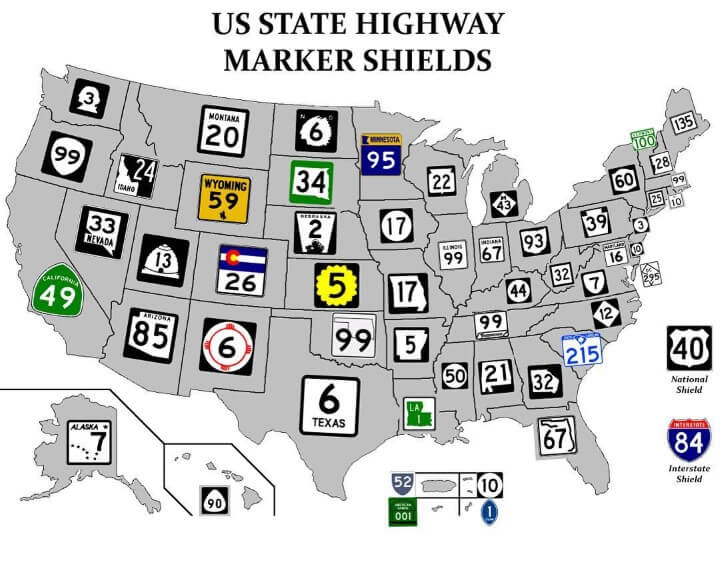
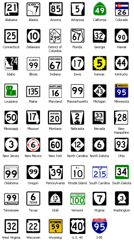
06/29/2018 at 10:55 • Filed to: None
 11
11
 37
37|
"ttyymmnn" (ttyymmnn)
06/29/2018 at 10:55 • Filed to: None | 11
| 37 |
Neato.
 Rusty Vandura - www.tinyurl.com/keepoppo
> ttyymmnn
Rusty Vandura - www.tinyurl.com/keepoppo
> ttyymmnn
06/29/2018 at 11:03 |
|
 Ash78, voting early and often
> ttyymmnn
Ash78, voting early and often
> ttyymmnn
06/29/2018 at 11:06 |
|
I love how Florida was always like “Dammit, we’re putting out state outline on the sign even though it’s the worst state for that!”
 CobraJoe
> Rusty Vandura - www.tinyurl.com/keepoppo
CobraJoe
> Rusty Vandura - www.tinyurl.com/keepoppo
06/29/2018 at 11:06 |
|
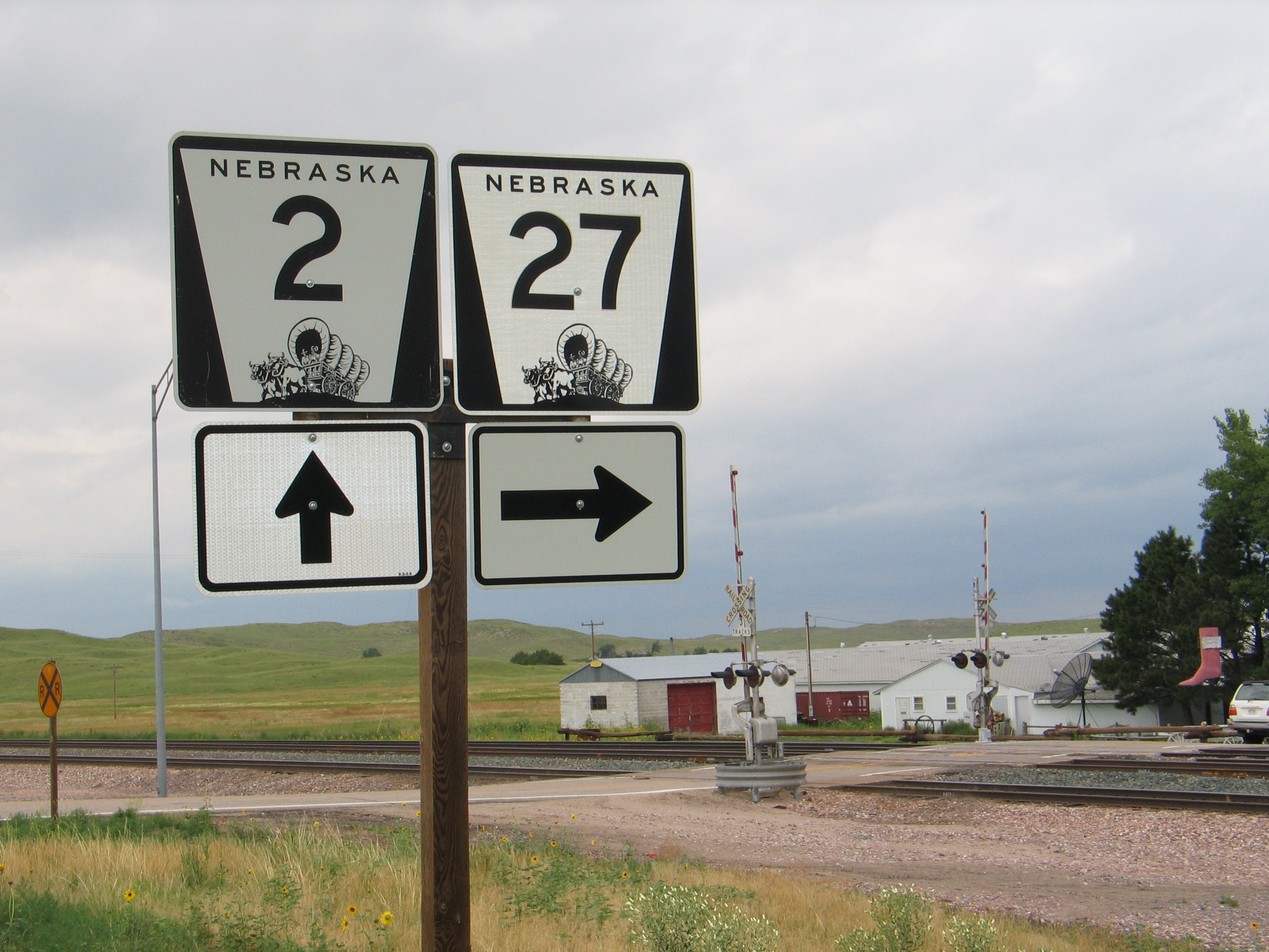
I feel like I should know where that is....
EDIT: Looks like the roads lead to Ellsworth NE. I’ve never actually been there. I guess rural NE looks the same all over the state
.
 deprecated account
> ttyymmnn
deprecated account
> ttyymmnn
06/29/2018 at 11:07 |
|
Is that Comic fucking Sans on Alaska’s???
 Bman76 (hates WS6 hoods, is on his phone and has 4 burners now)
> ttyymmnn
Bman76 (hates WS6 hoods, is on his phone and has 4 burners now)
> ttyymmnn
06/29/2018 at 11:10 |
|
I’ve always liked our Sunflower motif here in Kansas.
 ITA97, now with more Jag @ opposite-lock.com
> ttyymmnn
ITA97, now with more Jag @ opposite-lock.com
> ttyymmnn
06/29/2018 at 11:11 |
|
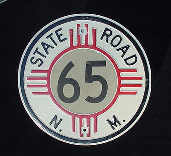
Not that the current NM state road signs are bad, but I really dig the ones used from the 20's up to about the 60's.
 WilliamsSW
> CobraJoe
WilliamsSW
> CobraJoe
06/29/2018 at 11:13 |
|
Centrally located - right in the middle of nowhere.
 Urambo Tauro
> ttyymmnn
Urambo Tauro
> ttyymmnn
06/29/2018 at 11:14 |
|
Interesting. Never seen them all together like that.
I would guess that if they ever were to adopt a nationally standardized format, it would probably end up being some sort of black-on-white-on-black version. I like the state-shaped ones, although I suppose that wouldn’t work very well for Hawaii...
|
CobraJoe
> WilliamsSW
06/29/2018 at 11:15 |
|
Oh, I’m familiar with the location... There’s just a lot of it.
 davesaddiction @ opposite-lock.com
> ttyymmnn
davesaddiction @ opposite-lock.com
> ttyymmnn
06/29/2018 at 11:17 |
|
Colorado is really nice. I prefer it, but it makes the numbers smaller (less legible). From a purely functional perspective, I think I give Illinois the nod.
 ShrimpHappens, née WJalopy
> ttyymmnn
ShrimpHappens, née WJalopy
> ttyymmnn
06/29/2018 at 11:21 |
|
In re: New Hampshire
Didn’t that face-on-the-mountain formation fall off?
|
WilliamsSW
> CobraJoe
06/29/2018 at 11:23 |
|
I’ve spent some time in Alliance/Scottsbluff - very pretty out there, but very empty, too--
 Aremmes
> deprecated account
Aremmes
> deprecated account
06/29/2018 at 11:25 |
|
It wouldn’t shock me if they did use it, but it looks more like an italic
font with serifs
.
|
deprecated account
> Aremmes
06/29/2018 at 11:29 |
|
Just checked google images for a larger image, thankfully it’s not comic sans
|
CobraJoe
> WilliamsSW
06/29/2018 at 11:31 |
|
Haven’t been that far west since high school, so I don’t remember that much of it, but I grew up on the eastern edge of the sandhills and visit there fairly regularly.
Maybe we need to head out of the way to go to C
arhenge on our summer trip though...
|
ttyymmnn
> CobraJoe
06/29/2018 at 11:31 |
|
Nebraska looks like Nebraska all over the state. Which is not to say that’s it’s boring, just somewhat derivative.
|
ttyymmnn
> Bman76 (hates WS6 hoods, is on his phone and has 4 burners now)
06/29/2018 at 11:32 |
|
Have driven across KS. Can confirm.
|
Aremmes
> ttyymmnn
06/29/2018 at 11:32 |
|
I should point out that Puerto Rico uses a stupid mix of route marker shields with absolutely no consistency. They also use round markers, pentagonal county route markers (on state routes, mind), white-on-black shields similar to the blue one in the image, and randomly shaped
pieces of painted plywood or MDF
.
|
ttyymmnn
> ITA97, now with more Jag @ opposite-lock.com
06/29/2018 at 11:33 |
|
Back when road atlases literally said things like, “Turn at the white farmhouse and cross the bridge....”
|
ttyymmnn
> davesaddiction @ opposite-lock.com
06/29/2018 at 11:34 |
|
Very similar to TX. Boring, but efficient.
|
ttyymmnn
> ShrimpHappens, née WJalopy
06/29/2018 at 11:34 |
|
Yes , 15 years ago.
|
CobraJoe
> ttyymmnn
06/29/2018 at 11:35 |
|
That’s the truth.
I’ve lived here long enough to see the difference between the hills of the sandhills and the hills of the eastern half of the state.... But yeah.
|
ttyymmnn
> CobraJoe
06/29/2018 at 11:38 |
|
I have driven across KS from south to north (spent the night in Lindeborg), as well as the eastern third to KC. The state gets a bad rap for being flat and boring, but I love the grasslands, especially in early summer.
 Highlander-Datsuns are Forever
> ttyymmnn
Highlander-Datsuns are Forever
> ttyymmnn
06/29/2018 at 11:39 |
|
Sings are better than the roads.
|
Highlander-Datsuns are Forever
> ttyymmnn
06/29/2018 at 11:40 |
|
Sorry montana’s signs are boring, but our roads are not.
|
ttyymmnn
> Highlander-Datsuns are Forever
06/29/2018 at 11:43 |
|
I made it to South Dakota and Wyoming this year. Haven’t quite gotten up to Montana yet (though I’ve been on the Canadian side).
 interstate366, now In The Industry
> ttyymmnn
interstate366, now In The Industry
> ttyymmnn
06/29/2018 at 11:47 |
|
Photographing highway signs used to be a hobby of mine. Somewhere on my old hard drive I have lots of Virginia and North Carolina ones.
|
WilliamsSW
> CobraJoe
06/29/2018 at 11:47 |
|
Carhenge and the other car art there are pretty cool. But I’m not sure that they’re w orth going all that far out of your way for. Mostly just to be able to say you’ve been there, I guess.
|
ttyymmnn
> interstate366, now In The Industry
06/29/2018 at 11:54 |
|
I’ve got this sticker on my van.
 Spanfeller is a twat
> ttyymmnn
Spanfeller is a twat
> ttyymmnn
06/29/2018 at 11:57 |
|
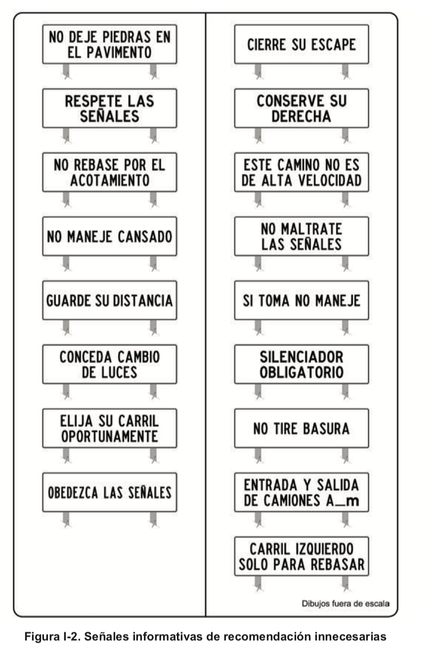
Those are literally laws but under Mexico’s highway code those are “unnecessary"
|
CobraJoe
> WilliamsSW
06/29/2018 at 12:18 |
|
Well, coming from Omaha, going to the black hills, and I want to avoid interstate (I’ve done it once before, it’s a decent trip). Dodging south through Alliance only adds 15min to the total trip compared to the most direct state highway route.
It’d be a great place to stop to stretch the legs at least.
 Eric @ opposite-lock.com
> Rusty Vandura - www.tinyurl.com/keepoppo
Eric @ opposite-lock.com
> Rusty Vandura - www.tinyurl.com/keepoppo
06/29/2018 at 12:57 |
|
In the small form I thought the sign had a steaming pile of dung at the bottom. Couldn’t remember that they had a picture on it...
|
Eric @ opposite-lock.com
> Ash78, voting early and often
06/29/2018 at 12:58 |
|
They should have just done a square sign with a tag line, “America’s Wang”.
|
WilliamsSW
> CobraJoe
06/29/2018 at 13:21 |
|
Oh, for that short of a detour, it’s worth it. And Alliance is a big enough town to take a break in, too - not many out there.
Plus, if anyone in the family is a railfan, it’s a very busy spot on the BNSF for coal trains coming out of the Powder River Basin.
|
CobraJoe
> WilliamsSW
06/29/2018 at 14:21 |
|
I’m sure our youngest would like to see some big trains, but we’ll see if I can talk my wife into spending more time in the car instead of taking the faster roads.
 FTTOHG Has Moved to https://opposite-lock.com
> ttyymmnn
FTTOHG Has Moved to https://opposite-lock.com
> ttyymmnn
06/29/2018 at 19:50 |
|
Interestingly here in NM, not all the signs have the Zia (sun) symbol on them. When you get far enough into the sticks they just use a simple white circle on a black square like Delaware, Iowa, Kentucky, etc. I assume it’s just for cost reasons.
 Doctor of internal combustion
> ttyymmnn
Doctor of internal combustion
> ttyymmnn
07/02/2018 at 15:25 |
|
that’s on my beer fridge, along with California 1, us 66, and a couple others I can’t remember